This page contains affiliate links. As an Amazon Associate I earn from qualifying purchases. Read the full disclosure.
Colour temperature doesn’t mean the actual physical temperature of a colour – it’s the psychological feeling it provides. Think of a shadow. It often looks like a cool dark blue colour when compared to a lit area. And inversely, a lit area looks like a warm orange or yellow compared to a shadow area.
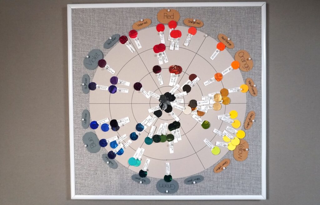
Understanding colour temperature is an important part of understanding colour mixing and combinations. A typical colour wheel can be essentially split in half between the warm and cool colours.
Watch me share about warm and cool colours on my Youtube channel.
Cool colours
Blue is the coolest colour on the colour wheel. If you put that in the centre of the cool half, that means the cool colours are green, blue and violet. Interestingly, straight out of a paint tube, colour colours are generally darker than warm colours, which helps make painting cool shadows easier. This isn’t always true but it’s a good rule of thumb.
Cool colours have the psychological effect of tranquility, relaxation, but also loneliness.
Warm colours
Orange is the warmest colour of the warm colours. Again, looking at a typical colour wheel, if you have orange in the centre of the warm half, that means red, orange and yellow are the warm colours. And since cool colours tend to be darker, warm colours are generally a lighter value straight from the tube.
Warm colours can feel energizing and happy, but can sometimes feel tiring.
Warmer and cooler vs. warm and cool
Colour temperature is relative. A cool colour can be warmer if it’s being compared to an even colour colour, and vice versa. This is a different concept than if the colour itself is warm or cool. I’ve heard artists say that they’re warming up a colour by adding blue. But if blue is the coolest colour, how can you warm up a colour by adding blue? It can happen if you take a very cool blue and add a blue that has red undertones. Take phthalo (green shade) and ultramarine blue. You can make a phthalo warmer by adding ultramarine blue since ultramarine has redder, and therefore warmer, undertones.
Ambiguous colour temperature
Now I’ve said that orange is the warmest and blue the coolest, but is it really? It can be challenging to fully pinpoint the truly warmest or coolest colour because it’s based on perception and I’m not a physicist. Some artists argue that ultramarine blue is the cooler blue, while others say that phthalos are the coolest blue. I think that blues with a green undertone are cooler than those with a red undertone, but ultimately, does it really matter? I might change my mind on which is cooler over the years and I’m not concerned with being exactly correct. Colour is relative so as long as I’m close enough and liking what I put on my canvas, I’m happy.
Being an artist means being comfortable in knowing that you won’t fully understand everything. I have the philosophy of learning and experimenting and getting to a place where I produce better and better paintings. It doesn’t need to be scientifically 100% correct.
Useful tips for how to use colour temperature as an artist
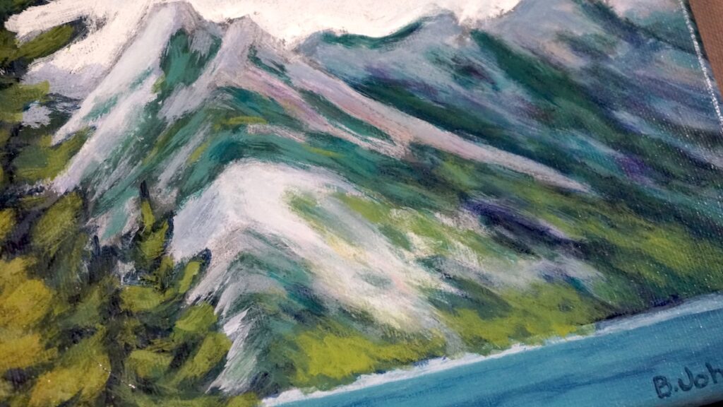
- Cool colours recede and shrink while warm colours come forward and expand. Think of a hazy blue stand of trees in the distance compared to a bright yellow flower in the foreground.
- Shadows are a cool colour while sun-drenched areas are warm. This doesn’t mean that you will always want to paint shadows blue. If the lighting differences between the shadow and light are dramatic, you’ll choose a cooler and warmer colour, respectively. But if the lighting differences are subtle, you would want to simply choose a slightly cooler or warmer mix to represent the shadow and light.
Learn more about colour theory for artists on my other blog posts.


