
This page contains affiliate links. As an Amazon Associate I earn from qualifying purchases. Read the full disclosure.
I’ve had a couple versions of pyrrole red in my pile of acrylic paint colours. When standing in the art store as an absolute beginner, both enticed me with their beautiful reds, each seeming to be a “classic” red. I’ve used them occasionally, but mostly relied on cadmium red and quinacridone magenta as my “warm” and “cool” reds. Now, I’m putting them to the test and seeing how they work and if they should have a permanent place on my palette.
I’m using both pyrrole red and pyrrole red dark acrylic paint in my tests. Both are modern colours, only dating back to the 1990s.
Pyrrole red
I’m testing Golden’s pyrrole red, in their fluid acrylic formula. That’s more liquid than their typical heavy body form but still has a high level of pigment. It uses pigment PR 254, which, like all pyrroles, is a synthetic pigment.
This version of pyrrole red is a very bright, classic red which is considered a “warm” red. It’s also called Ferrari red because it was used to paint some red Ferraris.
Pyrrole red dark
For the dark version of the pigment, I’m using Golden’s pyrrole red dark. It uses pigment PR 264, another synthetic pigment. It can go by different names, depending on the paint manufacturer, such as ruby red, crimson lake or carmine hue.
It’s a beautiful dark ruby red, which leans a bit more blue.
Mixing colours with the two pyrrole reds
I’m using several artist quality acrylic paint colours in my colour mixing tests, including:
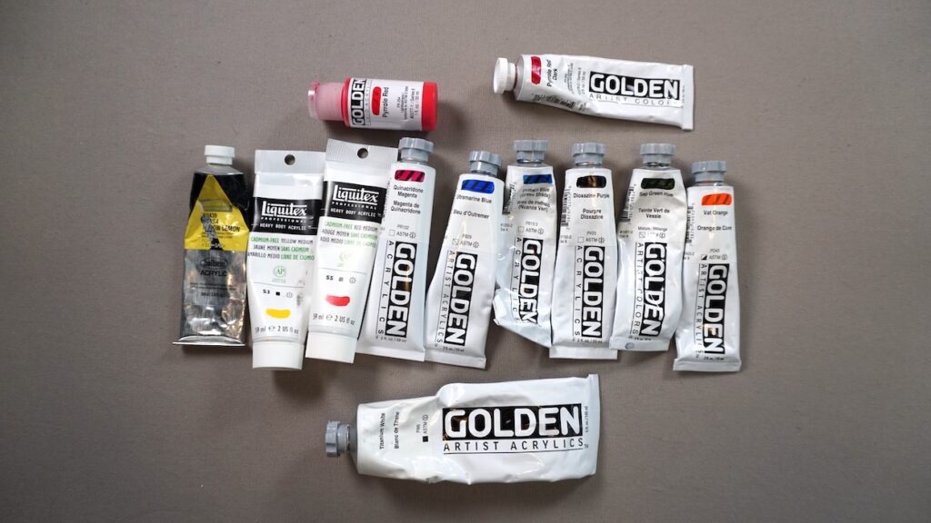
- Hansa yellow lemon
- Cadmium-free yellow medium
- Cadmium-free red medium
- Quinacridone magenta
- Ultramarine blue
- Phthalo blue (green shade)
- Dioxazine purple
- Sap green hue
- Vat orange
- Titanium white
Watch me test the two pyrrole reds on my Youtube channel.
Results
The first thing I noticed with the two versions of pyrrole is that they both are much closer to cadmium red than they are to quinacridone magenta, which are the two reds I usually keep on my palette. Pyrrole red is close to cadmium red, leaning a touch warm. Pyrrole red dark is definitely blue-leaning while still a classic red, although certainly not a colour you’d consider close to magenta or purple.
Both are also more transparent than cadmium red, with pyrrole red being more transparent than pyrrole red dark.
When it came to the mixes, I found pyrrole red to be a bit weaker than pyrrole red dark. It would get overwhelmed in a mix a bit more quickly than the dark version.
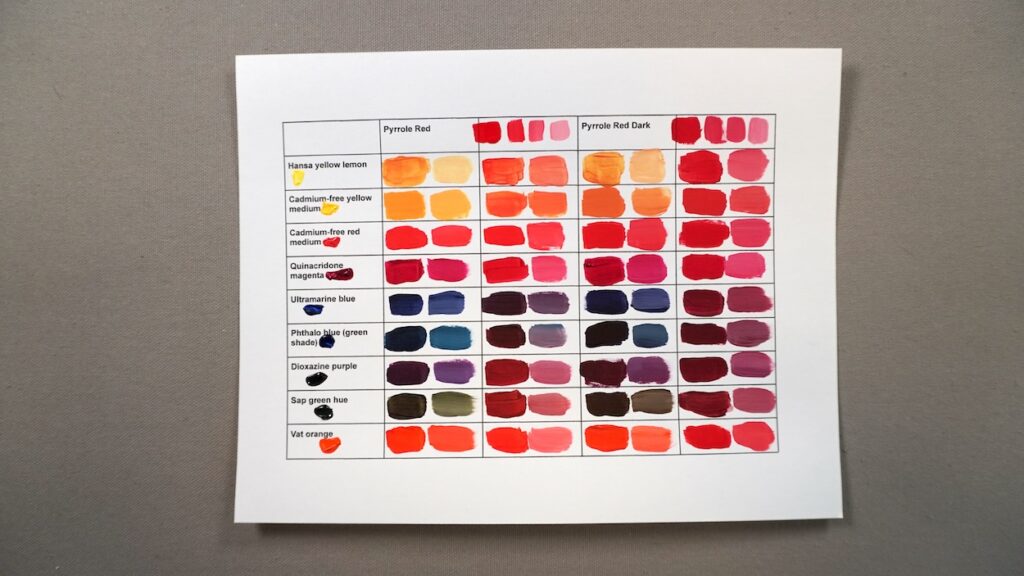
Despite the dark version leaning a bit more blue, the colour mixes weren’t dramatically different. I can notice a bit of a darker mix when with orange, due to blue and orange being complementary colours. The dark version also mixed a nice dark when mixed with Sap Green Hue.
Both made some very dark colours, almost black, when mixed with Phthalo blue (green shade), and really dark navy blue when mixed with ultramarine.
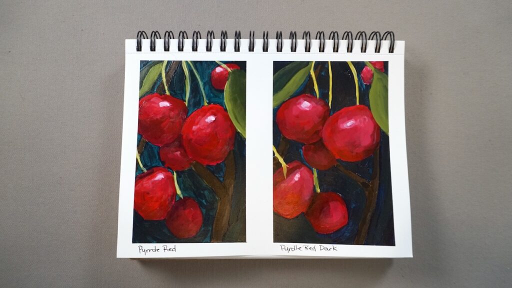
I did a couple quick paintings of cherries, to compare how the two work in actual paintings. Both did very well although I preferred pyrrole red dark overall. It’s opacity made the painting a bit easier to create. That’s a personal preference though – someone who likes layering transparent colours might prefer pyrrole red. Keep in mind that I used both pyrroles mixed with quinacridone magenta, along with some other colours from my palette, when I painted the cherries. I was able to pull both to be a bit more purple than they typically are.
Ultimately, I liked the pyrrole red dark version a bit better. Now, would I replace my cadmium red or quinacridone magenta on my palette with either? I think pyrrole red dark would be a great choice when painting florals because, when mixed with titanium white, it creates a beautiful pink without being too purple. Sometimes, that’s an issue with quinacridone magenta.
Learn more
Check out a listing of all my colour mixing blog posts and videos on my colour mixing roundup article.
Get your own
Pick up a version of pyrrole red at your local art supply store or on Amazon:


