
This page contains affiliate links. As an Amazon Associate I earn from qualifying purchases. Read the full disclosure.
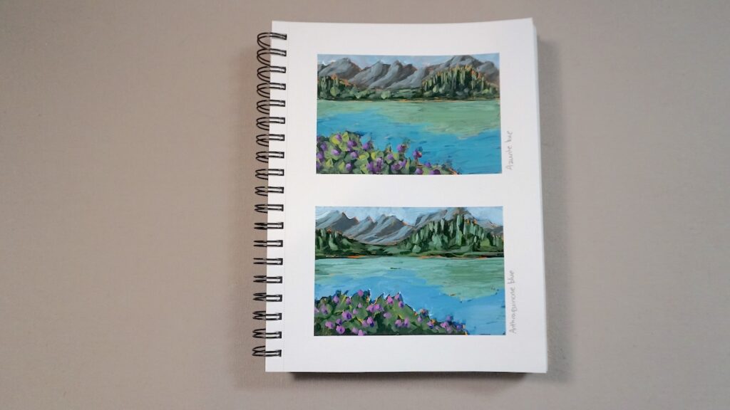
I’m looking at two blue acrylic paints that aren’t overly common on an artist’s palette – Anthraquinone blue and azurite hue. I first used Anthraquinone blue during an art workshop where the instructor provided a wide selection of paint colour choices and I loved the dark, deep blue in my paintings. Nowadays, I don’t use it very much as I did a few years ago but I still enjoy it when I use it.
I picked up azurite hue on a whim because I thought it looked nice in the store. I’ve used it a bit but it hasn’t really been a major part of my painting palette.
Today, I’ll see how the two compare and how they mix with other colours to see if they could become a permanent part of my acrylic paint colour rotation.
Anthraquinone blue
Anthraquinone blue is a very dark red-leaning blue produced by Golden Artist Colours, and it’s similar to indigo. It’s so dark that it’s nearly black. It’s also semi-transparent. It’s a modern blue which was synthesized in 1901.
It’s a single pigment paint – PB60, which is indanthrone blue. I have a tube of Windsor & Newton paint with the same pigment and they call their colour indathrene blue.
Azurite hue
Azurite hue is a historic colour, well, technically mimicking a historic colour. Azurite blue was made from a copper carbonate mineral, but the version I have is a hue, which means it is a mix of other pigments that look very similar to the original. The Golden Artist Colour tube I’m examining today is a mix of three pigments: PB 15:1 (phthalo blue red shade), PBr 7 (raw umber) and PW 4 (zinc white).
Since it’s a mix of phthalo blue which is a very dark green-leaning blue, raw umber which is a brown and zinc white, it’s a moderately dark neutral blue with a green bias. It’s also considered semi-transparent.
The real azurite, made from minerals, has been found on Egyptian wall paintings and was commonly used in Renaissance paintings in Europe, until lapis lazuli came on the scene. Even after that, it was regularly used because it was far less expensive than lapis lazuli. Ultramarine blue was extracted from lapis lazuli and was so expensive that it was generally reserved for the most important parts of a painting. The blue underneath was often azurite.
Comparing colour mixes
I tested how each of these blue mix with some common colours on an artist palette, choosing one warm and cool version of the primaries, plus three secondary colours:
- hansa yellow lemon
- cadmium-free yellow medium
- cadmium-free red medium
- quinacridone magenta
- ultramarine blue
- phthalo blue (green shade)
- dioxazine purple
- sap green hue
- cadmium orange
- titanium white
Note that I’m using the fluid version of Golden’s Anthraquinone blue. It’s just a thinner medium – the pigments are the same as the heavy body.
Watch me test out the two colours on my YouTube channel.
Results
The two are definitely different blues and it’s noticeable in the mixes. Anthraquinone blue is wonderful for creating purples and really dulled neutral greens, due to it’s red-leaning hue. Azurite hue makes great neutral turquoises.
I found Anthraquinone blue to have a fairly strong tinting power. It held its own in the mixes but wasn’t too overpowering. Azurite hue was definitely weaker but still a moderate tinting power.

Anthraquinone blue would be a good alternative to ultramarine blue, if you’re looking for a really dark blue. Keep in mind that it’s also very glossy, at least the Golden version is, so you may want to varnish to even out any difference in glossiness from other paints. It’s also a pricier paint colour, towards the higher end of Golden’s price tiers. Even though it’s somewhat pricy, I’ll still keep this colour on hand and use it occasionally.
Azurite hue might be a worthwhile alternative to a phthalo blue because it’s not as overpowering and intense as any of the phthalos, since it’s already muted and the value lightened by the addition of raw umber and zinc white. Personally, I don’t think I’ll be purchasing it again because I can just add a bit of raw umber and white easily to get to the same colour. It’s not very expensive though, so it won’t be a big hit on the wallet if you do decide you like the convenience.
Learn more
Check out a listing of all my colour mixing blog posts and videos on my colour mixing roundup article.
Get your own
Pick up your own tubes of Anthraquinone blue or azurite hue at your local art store or on Amazon:
US
Canada


