
This page contains affiliate links. As an Amazon Associate I earn from qualifying purchases. Read the full disclosure.
Choosing a green-leaning blue for your palette can be tricky. Do you go for the dark phthalos? Or the paler ceruleans? This blog post looks at cerulean blue and a similar colour: cerulean blue chromium. Both paints are a middle value – not overly dark or pale. Landscape artists particularly love them because they are the colour of the sky, almost straight from the tube. Both are a somewhat bright blue.
Cerulean blue
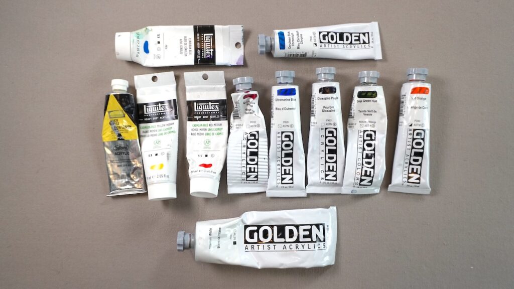
For today’s mixing tests, I have a tube of Liquitex cerulean blue for this testing. Cerulean blue has pigment PB 36 – a mixture of cobalt and tin oxides. It is opaque and excellent lightfastness.
Cerulean blue chromium
I signed up for an art course and the instructor suggested cerulean blue chromium. I don’t use cerulean much but I figured it was worth trying out. Cerulean blue chromium is the same pigment as regular cerulean blue – PB36, but the tin oxide is replaced with chromium, giving it a slightly greener hue.
Watch me test cerulean blue and cerulean blue chromium on my Youtube channel.
Colour mixing with cerulean blue
For today’s colour mixing test, I’m using some very common acrylic paint colours from around the colour wheel, plus titanium white:
- Hansa yellow lemon
- Cadmium-free yellow medium
- Cadmium-free red medium
- Quinacridone magenta
- Ultramarine blue
- Dioxazine purple
- Sap green
- Vat orange
Final thoughts
I don’t see much difference at all between the two. Straight from the tube, they basically look the same colour. I also see essentially no difference between the hues on the mixing sheet. There are some very minor differences but I think that has more to do with the amount of each paint colour than the differences between the two ceruleans.
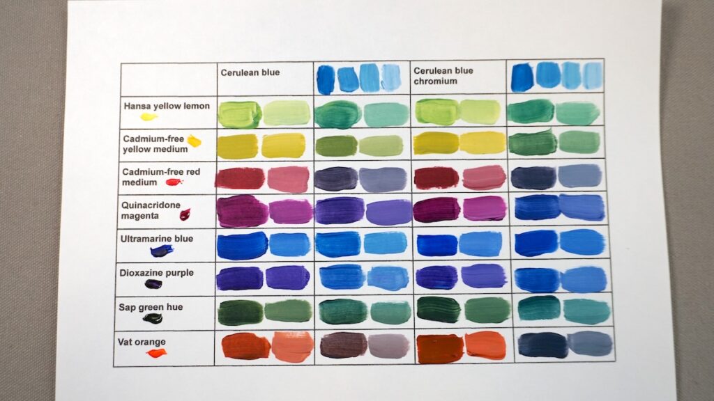
The one small difference I noticed was that cerulean blue is more opaque than the chromium version so some of the cerulean mixes seemed a touch chalkier than the chromium mixes.
Keep in mind that since cerulean blue, both the traditional and the chromium versions, are a middle value, so it’s challenging to get very dark colours when mixing.
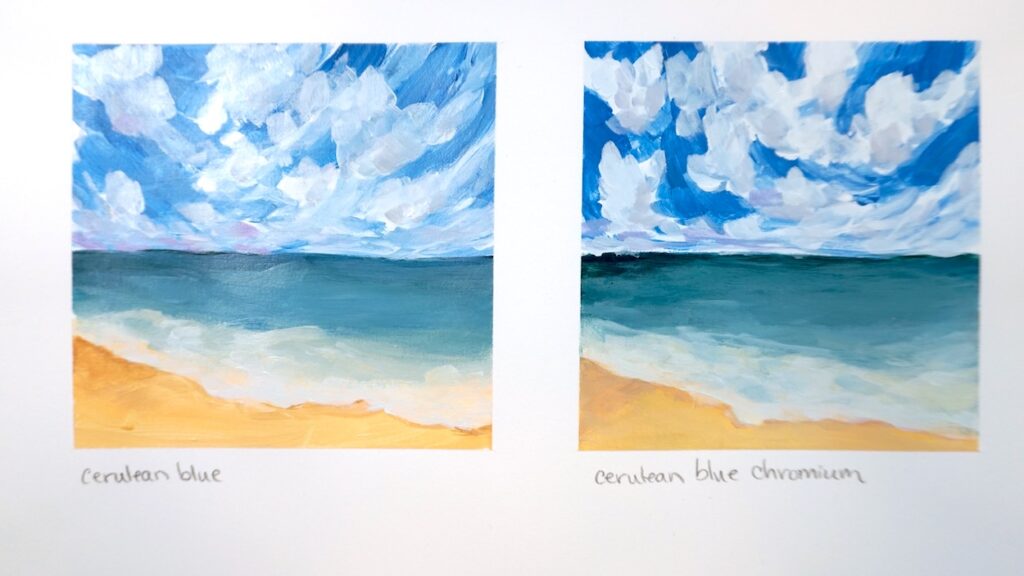
I also painted a pair of ocean and sky paintings to compare each of the cerulean blues. The skies were easy – no surprise because cerulean blues are well-known to be a great sky colour. The ocean was another story. I struggled getting a nice sea blue. I am very familiar with phthalo blues, which make painting an ocean sea simple, but I rarely use cerulean blue, so it could be something I get better with in practice. The advantage is phthalos can seem artificial and overpowering, while ceruleans don’t, so for many, they may be the better choice.
Learn more
Check out a listing of all my colour mixing blog posts and videos on my colour mixing roundup article.
Get your own
Pick up a version of cerulean blue at your local art supply store or on Amazon:


